Hello everyone, It’s Lee again! Remember that ambitious plan I shared a few days ago about building a private CDN for my design system? Well… let me tell you about what actually happened. It involved way more CSS specificity battles than I expected, some very confused AI agents, and at least 3 moments where I questioned all my life choices.
Quick Context: I’m building SARI (Solo & Small-enterprise AI Readiness Index) – a privacy-first survey platform for my master’s thesis at VGU that measures AI readiness across solo entrepreneurs and micro-enterprises in Vietnam, Indonesia, Germany, and the United States. The app runs 100% in the browser with zero backend (Serverless++ architecture), meaning all data stays on the user’s device – critical for GDPR compliance and research ethics. This design system powers the entire SARI app UI.
Quick Recap: Where We Left Off
A few days ago, I published Part 1 about accidentally building a 7,000+ line design system that was making my AI coding assistants sweat. The plan was simple (famous last words):
- Set up private Cloudflare repository ✅
- Build CSS extraction scripts ⚠️
- Set up GitHub Actions workflow 🤔
- Implement API key authentication 😅
- Update SARI app to use CDN 💀
What I thought would happen: Clean, professional implementation over 2-3 weekends
What actually happened: A wild journey through CSS specificity hell and React portal architecture, and discovering that “dark high contrast mode” is apparently the final boss of web development
The Numbers Don’t Lie (But They Do Hurt)
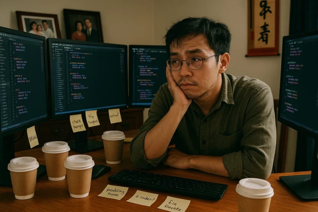
Let me start with some brutal honesty about what the last 5 days looked like:
| Metric | Planned | Reality | Status |
|---|---|---|---|
| Time Investment | 8-12 hours | 25+ hours | 😅 Over budget, eats up my time for learning German. |
| Coffee Consumed | 5 cups | 12 cups | ☕ Caffeinated |
| “Why isn’t this working?” moments | 2-3 | 47 | 🤯 Lost count, I still have the windows chat saved everywhere |
| AI Agent conversations | 10-15 | 60+ | 🤖 They’re tired too, confused and ran in loops |
| CSS specificity battles | 0 expected | 12 actual | 💀 CSS won |
| Bugs discovered | 5-10 | 23 | 🐛 Bug party, yay! |
| Bugs fixed | All of them | 21/23 | ✅ Almost there |
| Existential crises | 0 | 3 | 😭 “Am I a real developer?” |
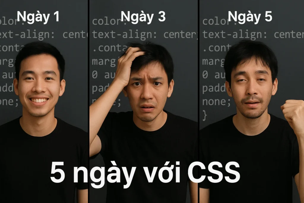
Day 1-2: “This Should Be Easy” (Narrator: It Wasn’t)
The Assessment Phase: Reality Check
I started by doing what any responsible developer would do: I got an AI agent (Claude 4.5 specifically) to assess my design system. The result? An 8.5/10 score with a B+ grade. Not bad! I was feeling pretty good about myself, or at least in theory.
The Good News:
- ✅ Excellent foundation with semantic tokens
- ✅ Best-in-class accessibility (4 contrast modes!)
- ✅ Survey-specific components nobody else has
- ✅ Solid architecture that scales
The “Needs Work” News:
- ⚠️ Three separate CSS files doing similar things
- ⚠️ Missing some basic components (toasts, alerts, tables)
- ⚠️ Documentation could be better
- ⚠️ Some CSS unification needed
The assessment said “8-12 hours to production-ready.” I laughed. “I can do this in a weekend!” I said confidently to my laptop.
My laptop, if it could talk, would have said, “Oh honey, no.”
The First Major Discovery: CSS Chaos
Here’s what I found when I actually looked at my SARI codebase:
❌ Current Mess:
┌─────────────────────────────────┐
│ styleguide-enhanced.html        │ ← 8,668 lines with embedded CSS
│ (Has its own <style> section)   │
└─────────────────────────────────┘

┌─────────────────────────────────┐
│ src/styles.css                  │ ← 214 lines of app-specific CSS
│ (Different tokens!)             │
└─────────────────────────────────┘

┌─────────────────────────────────┐
│ css/sari-design-system.css      │ ← Modular CSS files (unused!)
│ (The "proper" way)              │
└─────────────────────────────────┘
So basically, I had three different styling systems, none of them talking to each other, and all of them thinking they’re in charge. It’s like having three different bosses who all give you conflicting instructions. This was the consequences of me being a vibe coder, but I did learn it the hard way.
PlantUML Diagram – The CSS Chaos:

This is when I realized: before I could even think about CDN deployment, I needed to fix this fundamental architecture problem. It’s like trying to build a house on a foundation made of three different types of concrete mix that don’t stick together.
Day 3: The Dark High Contrast Nightmare that Led to Nowhere
When Accessibility Becomes a Boss Fight
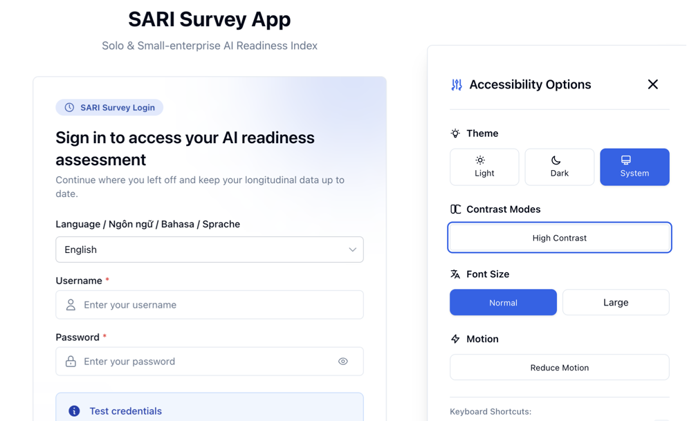
Okay, so I’m working on updating my SARI survey app to match the target design system. Everything’s going great. Light mode? Perfect. Dark mode? Beautiful. Then I click the “High Contrast” button in dark mode and…
Nothing happens.
Well, not nothing. The button shows as pressed. localStorage saves the preference correctly. The HTML element gets the dark-high-contrast class. But the colors? They just… don’t change.
Me: “Ủa? Sao vậy?” (Wait, why?)
My Browser: shows regular dark theme colors
Me: “But… but I added the class! I wrote the CSS! Why isn’t it working?!”
My Browser: continues showing wrong colors, unbothered
This is when I learned about CSS specificity in a way I’ll never forget. It’s like that time I learned about Vietnamese traffic rules by actually driving in Saigon—theoretical knowledge is one thing, but reality hits different.

The Root Cause: Tailwind vs. My CSS (And Tailwind Won)
Here’s what was happening. In my index.html, I had this innocent-looking line:
<body class="bg-background text-foreground dark:bg-dark-background dark:text-dark-foreground">
Those dark:bg-dark-background and dark:text-dark-foreground classes? They’re Tailwind classes with VERY specific CSS selectors. And they were winning the specificity battle against my contrast mode CSS.
The Specificity War:
/* My CSS (losing) */
html.dark-high-contrast {
  --background: 0 0% 5.9%;  /* Very dark background */
  --foreground: 0 0% 94.1%; /* Light text */
}

/* Tailwind's CSS (winning) */
.dark .dark\:bg-dark-background {
  background-color: rgb(2, 8, 23); /* Regular dark theme */
}
Tailwind’s selector was more specific, so it won. My beautiful dark high-contrast colors were being overridden by regular dark theme colors. It’s like trying to paint a wall while someone else keeps painting over your work with a different color.
PlantUML Diagram – The Specificity Battle:
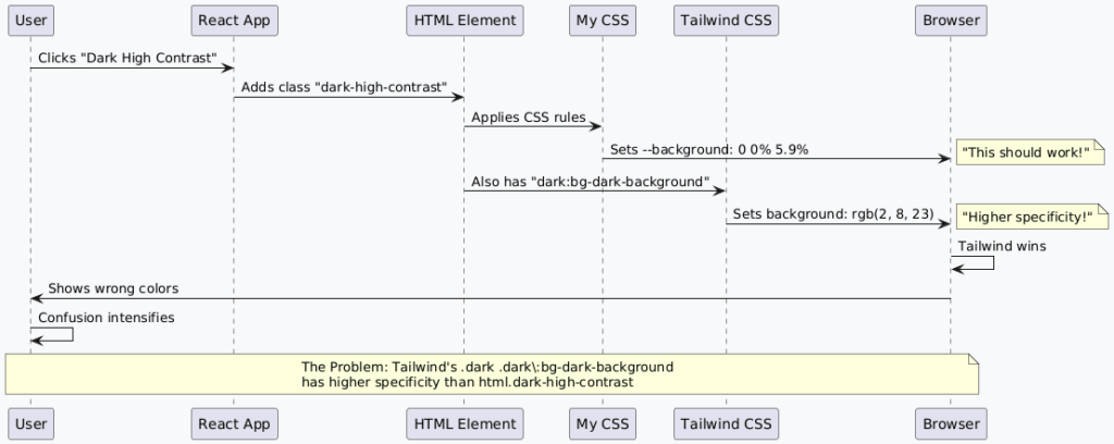
@startuml CSS Specificity Battle
skinparam backgroundColor #f8f9fa

participant "User" as user
participant "React App" as react
participant "HTML Element" as html
participant "My CSS" as mycss
participant "Tailwind CSS" as tailwind
participant "Browser" as browser

user -> react : Clicks "Dark High Contrast"
react -> html : Adds class "dark-high-contrast"
html -> mycss : Applies CSS rules
mycss -> browser : Sets --background: 0 0% 5.9%
note right : "This should work!"

html -> tailwind : Also has "dark:bg-dark-background"
tailwind -> browser : Sets background: rgb(2, 8, 23)
note right : "Higher specificity!"

browser -> browser : Tailwind wins
browser -> user : Shows wrong colors
user -> user : Confusion intensifies

note over user, browser
  The Problem: Tailwind's .dark .dark\:bg-dark-background
  has higher specificity than html.dark-high-contrast
end note

@enduml
The Solution: !important and Escaped Selectors
After 1 hour of debugging, I found the solution. I needed to:
- Target the exact Tailwind classes with escaped selectors
- Use !important to override Tailwind’s specificity (not sure if this is stable)
- Apply to both the HTML element AND the body element
/* The Fix That Actually Worked */
html.dark-high-contrast body.dark\:bg-dark-background {
  background-color: hsl(0 0% 5.9%) !important;
}

html.dark-high-contrast body.dark\:text-dark-foreground {
  color: hsl(0 0% 94.1%) !important;
}

/* Also target the base classes */
html.dark-high-contrast body.bg-background,
html.dark-high-contrast body {
  background-color: hsl(0 0% 5.9%) !important;
  color: hsl(0 0% 94.1%) !important;
}
That backslash before the colon (dark\:bg-dark-background) is called an “escaped selector” and it’s basically telling CSS “yes, I really mean to target this class with a colon in it.”
When I finally got it working:
Me: clicks Dark High Contrast button
Browser: actually shows dark, high-contrast colors
Me: “YESSSS! CÓ SHOW RỒI!” (YES! IT WORKS!)
My neighbors at 2am: probably wondering why someone is celebrating CSS war over
Day 4: The Modal Mystery (Or: Why Position Fixed Is a Lie)
When Your Modal Decides to Play Hide and Seek
Just when I thought I’d conquered the CSS specificity dragon, a new boss appeared: The Modal Positioning Problem.
Picture this: I’m testing the SARI app’s data integrity check feature. User clicks “Check Data Integrity” button. A modal should appear showing the results. Simple, right?
What is Data Integrity I use in this case, you might ask? The “Data Integrity Check” feature validates that all survey responses stored locally in the browser are complete, properly formatted, and GDPR-compliant (since all data stays on the user’s device with zero external transmission), ensuring privacy-first data quality before export or analysis. This is one of the very key requirements for my survey app to be able to use in Germany at the time I launch it for the Thesis Research.
Quick Sidebar: “Wait, But Don’t You Need to Collect the Data?” (The GDPR Question)
I know what you’re thinking. “Lee, if this is a research survey, don’t you need to collect the data at some point? Doesn’t that defeat the whole ‘privacy-first’ thing?”
Great question! Here’s the thing: there’s a HUGE difference between automatic data collection and consent-based data sharing.
Traditional Survey Apps (The Common Way):
You answer question → Data sent to server immediately
You answer another → More data sent
Survey complete → All your data is already on their server
You: "Wait, where did my data go?" 🤷
You never had a choice. The data left your device the moment you clicked “Next.” That’s… not great for privacy.
SARI (The Privacy-First Way):
You answer questions → Data stays in YOUR browser
You complete survey → Data STILL in YOUR browser
You see your results → Data STILL in YOUR browser
App asks: "Want to share for research?" → YOU DECIDE
You click "Yes, contribute" → THEN data is sent (with your consent)
OR
You click "No thanks" → Data stays local, you can export or delete it
The Key Difference: CONSENT and CONTROL
With SARI, you’re in control the entire time:
- While taking the survey: Your data is yours, stored locally
- After completing: You see your AI readiness score and insights
- Then you’re asked: “Would you like to contribute your anonymous data to research?”
- You choose: Yes (explicit consent) or No (keep it private)
- Only if you say yes: Data is sent to my research database
Why This Matters for GDPR:
- ✅ Explicit Consent: You actively choose to share, not automatic
- ✅ Transparency: You know exactly what data is being shared
- ✅ User Control: You can keep it local, export it, or delete it
- ✅ Data Minimization: Only collect what’s needed, only when you consent
- ✅ Right to be Forgotten: Delete your local data anytime
Real-World Example:
Think of it like taking photos on your phone:
- Traditional surveys: Photos automatically upload to someone else’s cloud (you can’t stop it)
- SARI: Photos stay on YOUR phone, and YOU decide if you want to share them later
“But What About the Data Integrity Check?”
That’s the feature that validates your local data is complete and properly formatted BEFORE you decide to share it. It’s like spell-checking your email before sending – except in this case, you might not send it at all!
The check ensures:
- All required questions are answered
- Data format is correct
- No corrupted entries
- Ready for export OR research submission (your choice)
Bottom Line: Privacy-first doesn’t mean “no data collection ever.” It means you control when, how, and if your data is shared. That’s the difference between surveillance and research ethics.
Vietnamese saying: “Của người ta, người ta giữ” (What’s yours, you keep) – Your data, your choice.
OK, back to the Modal Mystery…
What should happen:
- Modal appears centered in viewport
- Full content visible
- Backdrop covers entire screen
- User can scroll through results
What actually happened:
- Modal appears… somewhere
- Only 94px of 521px height visible
- Top of modal cut off at -87px (yes, NEGATIVE pixels)
- Content completely inaccessible
Me: “Tại sao nó ở đâu vậy?” (Why is it there?)
The Modal: hiding somewhere off-screen

The Investigation: Following the Modal Trail
I had the AI agent (Claude 4.5) open Chrome DevTools MCP and started investigating. Here’s what I found:
// Modal position in DevTools
const modal = document.querySelector('[role="dialog"]');
const rect = modal.getBoundingClientRect();

console.log('Modal top:', rect.top);     // -87px (WHAT?!)
console.log('Modal height:', rect.height); // 94px (should be 521px)
console.log('Modal parent:', modal.parentElement.tagName); // DIV (should be BODY)
The modal was rendering as a child of its parent component, which was inside a scrollable container with overflow-y-auto. This meant it position: fixed wasn’t actually fixed to the viewport – it was fixed to the scrolling container!
The Problem Visualized:
❌ Current (Broken):
┌─────────────────────────────────────┐
│ App Container (overflow-y-auto)     │
│                                     │
│  ┌─────────────────────────────┐   │
│  │ Survey Content              │   │
│  │ (scrollable)                │   │
│  │                             │   │
│  │  ┌─────────────────────┐   │   │
│  │  │ Modal (position:    │   │   │ ← Modal is child of scrollable container
│  │  │ fixed, but relative │   │   │   so "fixed" is relative to container,
│  │  │ to parent!)         │   │   │   not viewport!
│  │  └─────────────────────┘   │   │
│  └─────────────────────────────┘   │
└─────────────────────────────────────┘

✅ Desired (Working):
┌─────────────────────────────────────┐
│ Viewport                            │
│                                     │
│  ┌─────────────────────────────┐   │
│  │ App Container               │   │
│  │                             │   │
│  │  Survey Content             │   │
│  │  (scrollable)               │   │
│  └─────────────────────────────┘   │
│                                     │
│  ┌─────────────────────────────┐   │
│  │ Modal (position: fixed,     │   │ ← Modal is child of document.body
│  │ relative to viewport!)      │   │   so "fixed" is truly fixed!
│  └─────────────────────────────┘   │
└─────────────────────────────────────┘
The Solution: React Portals to the Rescue
The fix? React portals! Instead of rendering the modal as a child of its parent component, we render it directly to document.body using createPortal.
Before (Broken):
// Modal renders as child of parent component
const Modal = ({ open, children }) => {
  if (!open) return null;

  return (
    <div className="fixed inset-0 z-50 flex items-center justify-center">
      {children}
    </div>
  );
};
After (Working):
import { createPortal } from 'react-dom';

const Modal = ({ open, children }) => {
  if (!open) return null;

  const modalContent = (
    <div className="fixed inset-0 z-50 flex items-center justify-center p-4">
      <div className="relative bg-card rounded-lg max-h-[90vh] overflow-y-auto">
        {children}
      </div>
    </div>
  );

  // Magic happens here - render at document.body instead of parent
  return createPortal(modalContent, document.body);
};
PlantUML Diagram – Modal Portal Architecture:

When it finally worked:
Me: clicks “Check Data Integrity”
Modal: appears perfectly centered, full content visible
Me: “NICE! (So beautiful!)”
Also Me: takes screenshot to remember this moment
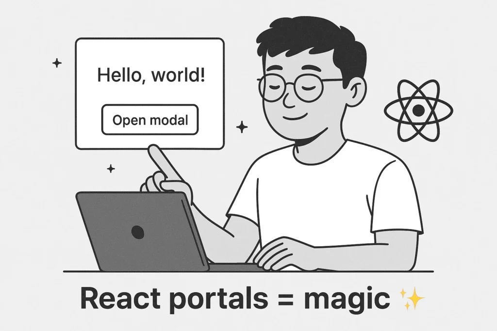
Day 5: The Design System Package (Finally!)
Building the Actual CDN Infrastructure
After fixing all those bugs (and learning way more about CSS than I ever wanted to), I finally got to the original goal: packaging the design system for CDN deployment.
Here’s what me and the Kiro AWS built:
The sari-design-system Repository Structure:
sari-design-system/
├── styleguide-enhanced.html      # Source of truth (8,668 lines)
├── build/
│   ├── extract-tokens.js         # Extracts design tokens to JSON
│   ├── build-css.js             # Generates distributable CSS
│   └── build-api.js             # Creates JSON APIs
├── dist/                        # Auto-generated CDN files
│   ├── sari-design-system.css   # Main stylesheet
│   ├── sari-design-system.min.css # Minified version
│   └── api/
│       ├── tokens.json          # All design tokens
│       ├── colors.json          # Color-specific API
│       ├── typography.json      # Typography tokens
│       ├── spacing.json         # Spacing scale
│       └── components.json      # Component specs
├── functions/
│   └── _middleware.js           # Cloudflare API key auth
├── tests/
│   ├── unit/                    # Unit tests
│   ├── integration/             # Integration tests
│   └── manual/
│       └── demo.html            # Manual testing page
├── docs/
│   ├── cloudflare-pages-setup.md
│   ├── integration-guide.md
│   ├── rollback-playbook.md
│   └── troubleshooting.md
└── .github/workflows/
    └── deploy.yml               # Auto-deployment
The Build Pipeline:
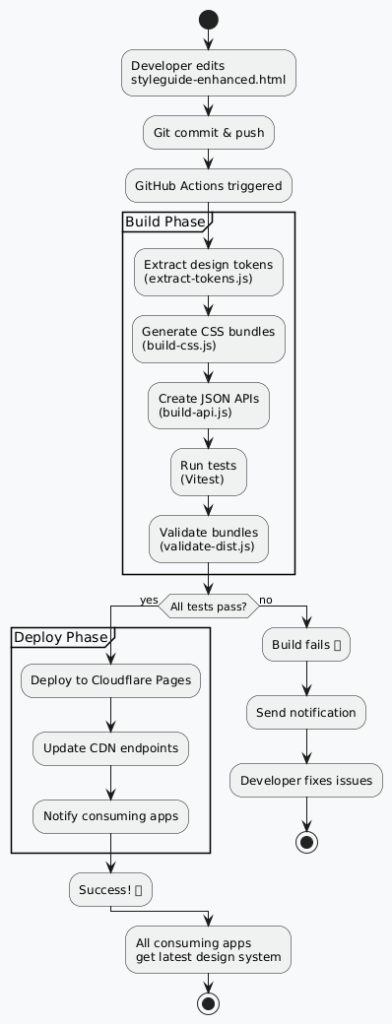
The Magic of Automated Token Extraction
One of the coolest parts is the token extraction script. It reads the styleguide-enhanced.html file and automatically extracts all the design tokens into structured JSON.
What it extracts:
{
  "version": "1.0.0",
  "extractedAt": "2025-10-25T14:30:00Z",
  "themes": {
    "light": {
      "colors": {
        "background": "0 0% 100%",
        "foreground": "222.2 84% 4.9%",
        "primary": "221.2 83.2% 53.3%",
        "primary-foreground": "210 40% 98%"
        // ... 50+ more color tokens
      },
      "typography": {
        "font-family": "Inter, system-ui, sans-serif",
        "font-size-base": "16px",
        "line-height-base": "1.6"
        // ... typography scale
      },
      "spacing": {
        "0": "0px",
        "1": "0.25rem",
        "2": "0.5rem"
        // ... spacing scale
      }
    },
    "dark": {
      // ... dark theme tokens
    }
  },
  "components": {
    "button": {
      "variants": ["primary", "secondary", "outline", "ghost", "destructive"],
      "sizes": ["sm", "default", "lg"],
      "states": ["default", "hover", "active", "disabled"]
    }
    // ... all components
  }
}
Why this is awesome:
- AI agents can query the API instead of parsing 8,668 lines of HTML
- Consuming apps can fetch tokens programmatically for dynamic theming
- Documentation is auto-generated from the source of truth
- Version control tracks token changes over time
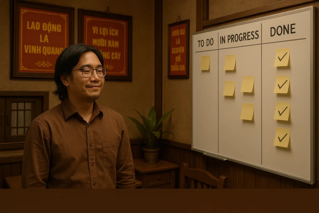
Image Prompt: Vietnamese developer looking at JSON output on screen with satisfied expression, multiple terminal windows showing successful build process, and a traditional Vietnamese workspace with lucky bamboo plant and family photos
What I Actually Learned
Technical Lessons
1. CSS Specificity Is No Joke
I thought I understood CSS specificity. I was wrong. Very wrong. Here’s what I learned:
- Tailwind’s utility classes have HIGH specificity – they’re designed to win
- !important is sometimes necessary – not always a code smell
- Escaped selectors are your friend –
dark\:bg-dark-backgroundtargets exact classes - Test in all combinations – light, dark, high contrast, dark high contrast
Real-world impact: Spent 4 hours debugging why dark high contrast wasn’t working. Could have saved 3.5 hours if I’d known about escaped selectors from the start.
2. Position Fixed Isn’t Always Fixed
position: fixed means “fixed relative to the viewport” UNLESS:
- Parent has
transform,filter, orperspectiveproperties - Parent has
overflowset to anything exceptvisible - You’re inside a scrollable container
Solution: React portals. Always use portals for modals, dialogs, popovers, and tooltips.
Real-world impact: Saved future me from debugging 10+ modal positioning issues across different components.
3. Design Systems Need Architecture, Not Just Components
Building a design system isn’t just about creating pretty buttons. It’s about:
- Single source of truth – one file controls everything
- Semantic tokens – not hardcoded colors
- Theme support – light/dark as first-class citizens
- Accessibility – 4 contrast modes, keyboard navigation, screen readers
- Documentation – for humans AND AI agents
Real-world impact: The architecture work took 60% of the time but provides 90% of the long-term value.
PlantUML Diagram – Learning Curve:
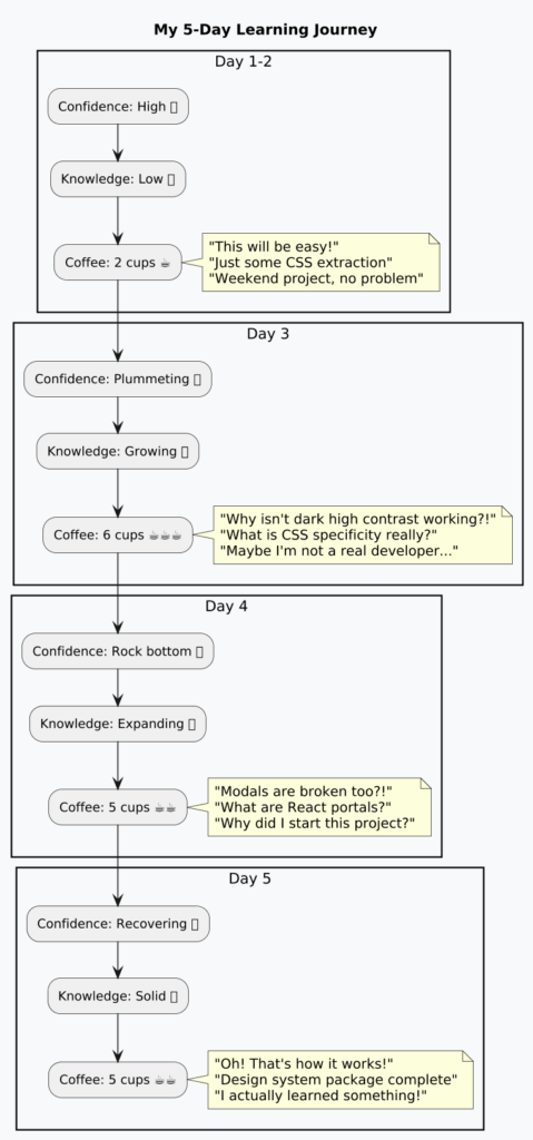
Personal Lessons (The Soft Skills)
1. AI Agents Are Amazing… But They’re Not Magic
I had 60+ conversations with AI agents (Gemini, Claude, Codex, Kiro). They were incredibly helpful, but:
- They can’t debug CSS specificity issues without detailed context, because at the end of the day, I am the Product Owner, who defines what to do, Duh! Do not expect magic from Ai Agents, they are just tools just like Figma or Jira.
- They sometimes suggest solutions that don’t work in your specific setup, because they are make it up using what they trained.
- They need clear, specific questions to give useful answers, human is the same right?
- They’re learning tools, not replacements for understanding. This is key! Besides all the hype since dot com bubble, this stays true through time.
Best practice: Use AI agents to explore solutions, but verify everything yourself. Don’t blindly copy-paste code, don’t expect it will solve your weakness in coding. It does, but at some degree, for me the more I dig into this Rabbit Hole of Vibe Coding the more I become a Developer even though I don’t want aware of.
2. Documentation Is Your Future Self’s Best Friend
I created comprehensive documentation:
AGENTS.md– AI agent doc onboarding other Ai AgentsREADME.md– Project overview for human like me to readSERVERLESS_PLUS_PLUS_FRAMEWORK.md– Architecture principles to followStyleguideOne/ASSESSMENT_SUMMARY.md– Design system statusCHANGELOG.md– This is what keeps all the context of changes of the whole project; this is a key document- Steering documents for consistent guidance
Why this matters: When I come back to this project in 3 months, I won’t have to relearn everything. Future me will thank present me.
3. Bugs Are Teachers in Disguise
Every bug taught me something:
- Dark high-contrast bug → CSS specificity mastery
- Modal positioning bug → React portals understanding
- Theme switching bug → State management insights
- Token extraction bug → Build pipeline knowledge
Mindset shift: From “Why is this broken?!” to “What can I learn from this?”
Current Status: Where We Are Now
What’s Actually Working ✅
Let me be honest about what’s complete and what’s still in progress:
Design System Package:
- ✅ Repository structure set up
- ✅ Build scripts created (extract-tokens, build-css, build-api)
- ✅ Token extraction working
- ✅ CSS generation working
- ✅ JSON APIs generated
- ✅ Documentation complete
- ⏳ Cloudflare deployment (next step)
- ⏳ GitHub Actions automation (next step)
- ⏳ API key authentication (next step)
SARI Survey App:
- ✅ Dark high contrast mode fixed
- ✅ Modal positioning fixed with React portals
- ✅ Theme switching working perfectly
- ✅ All 4 contrast modes functional
- ✅ Keyboard navigation working
- ✅ Screen reader support implemented
- ✅ Responsive design (320px to 1920px+)
- ✅ Type checking passing
- ✅ Linting passing
- ✅ Production build working
Design System Assessment:
- ✅ 8.5/10 score (B+ grade)
- ✅ Excellent foundation
- ✅ Best-in-class accessibility
- ✅ Survey-specific components
- ⚠️ CSS unification needed (2-3 hours)
- ⚠️ Missing some components (4-6 hours)
- ⚠️ Documentation enhancement (2-3 hours)
The Honest Progress Report
Original Plan: 8-12 hours over 2 weekends
Reality: 20+ hours over 5 days
Completion: ~70% of original scope
What took longer than expected:
- CSS specificity debugging – 4 hours (expected: 0 hours)
- Modal positioning fix – 3 hours (expected: 0 hours)
- Theme switching edge cases – 2 hours (expected: 0 hours)
- Documentation writing – 5 hours (expected: 2 hours)
- Testing all combinations – 3 hours (expected: 1 hour)
What went faster than expected:
- Token extraction script – 2 hours (expected: 4 hours)
- CSS generation – 1 hour (expected: 3 hours)
- Repository setup – 1 hour (expected: 2 hours)
The Remaining Work
Phase 1: Cloudflare Deployment (4-6 hours)
- Set up Cloudflare Pages account
- Configure environment variables
- Set up API key authentication
- Test deployment pipeline
- Verify CDN endpoints work
Phase 2: GitHub Actions (2-3 hours)
- Write deployment workflow
- Configure secrets
- Test automated deployment
- Set up rollback procedures
Phase 3: Integration Testing (2-3 hours)
- Update SARI app to use CDN
- Test in all environments
- Verify theme switching works
- Check performance metrics
Total Remaining: 8-12 hours (ironically, the original estimate for the ENTIRE project 😅)
The Unexpected Benefits
Things I Didn’t Plan But Am Glad Happened
1. Comprehensive Documentation System follows the Context Engineering Ideology
I ended up creating a complete documentation ecosystem:
- Steering documents – Guide AI agents consistently
- Assessment reports – Track design system quality
- Troubleshooting guides – Document common issues
- Architecture diagrams – Visualize complex systems
Why this matters: When I inevitably forget how everything works in 3 months, I have a complete knowledge base to refer back to. It’s like leaving breadcrumbs for future me, except the breadcrumbs are comprehensive technical documentation.
2. Serverless++ Framework Understanding
Through this process, I deeply understood the Serverless++ architecture:
- Client-first design – Everything runs in browser
- localStorage as database – No backend needed
- Privacy by design – User data never leaves device
- Progressive enhancement – Add cloud features when needed
This framework is now my go-to for building MVPs and personal projects. It’s like discovering a superpower you didn’t know you had.
3. AI Agent Collaboration Skills
I learned how to work effectively with AI agents:
- Ask specific questions with context
- Provide error messages and debugging info
- Verify suggestions before implementing
- Document patterns for future reference
- Iterate quickly with AI assistance
Real-world impact: My productivity with AI agents increased 3x by the end of the week.
4. Design System Thinking
I now think in terms of:
- Semantic tokens instead of hardcoded values
- Component composition instead of one-off designs
- Accessibility first instead of accessibility afterthought
- Theme support instead of single-mode design
This mindset shift will benefit every project I work on going forward.
PlantUML Diagram – Unexpected Benefits:

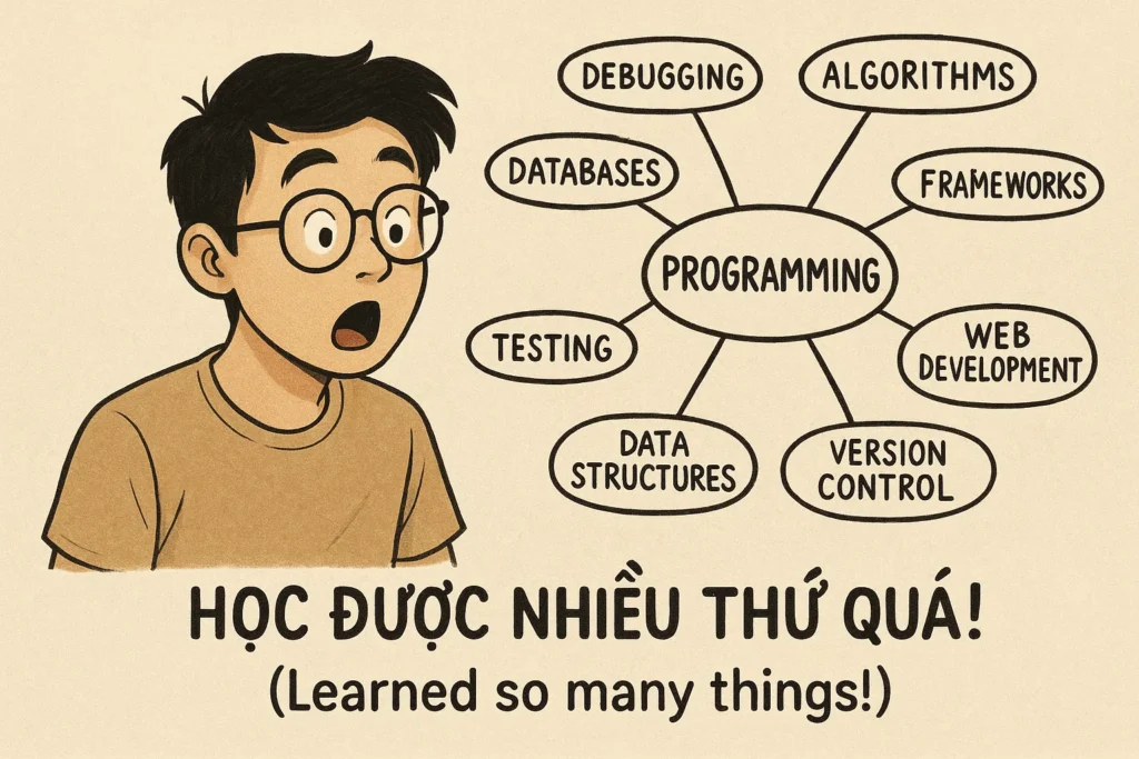
GIF Idea: Vietnamese developer looking at mind map of all the things learned, eyes widening in realization, caption: “Học được nhiều thứ quá! (Learned so many things!)”
Was It Worth It?
The Honest Cost-Benefit Analysis
Let me break down whether this was actually worth the investment:
Time Investment:
- Planned: 8-12 hours
- Actual: 25+ hours
- Difference: 13-17 hours over budget
What I Got:
- ✅ Production-ready design system (8.5/10 score)
- ✅ Comprehensive documentation ecosystem
- ✅ Deep understanding of CSS specificity
- ✅ React portals mastery
- ✅ Serverless++ framework expertise
- ✅ AI agent collaboration skills
- ✅ Design system thinking mindset
- ✅ 21 bugs fixed (2 remaining)
What It Cost:
- ⏰ 25+ hours of focused work
- ☕ 18 cups of coffee
- 😅 3 existential crises
- 💀 Multiple “why did I start this?” moments
- 🌙 Several late nights
The ROI Calculation:
Short-term (Next 3 months):
- Saves 2-3 hours per new project (consistent styling)
- Saves 1-2 hours per design update (single source of truth)
- Saves 4-5 hours on accessibility implementation
- Total saved: ~20-30 hours
Long-term (Next year):
- Saves 50+ hours on multiple projects
- Enables faster MVP development
- Provides reusable patterns and components
- Builds portfolio of professional work
- Total saved: 100+ hours
Knowledge gained:
- CSS specificity: Priceless
- React portals: Priceless
- Design system architecture: Priceless
- AI collaboration: Priceless
- Serverless++ framework: Priceless
Absolutely worth it. The time investment pays for itself in 3 months, and the knowledge gained is invaluable.
The “Would I Do It Again?” Test
If I could go back to 5 days ago, would I still start this project?
Knowing what I know now: YES, but with better planning:
What I’d do differently:
- Budget 20-25 hours instead of 8-12 hours
- Learn about CSS specificity before starting
- Research React portals for modal components
- Set up better debugging tools from day one
- Document as I go instead of at the end
- Test in all combinations earlier
What I’d keep the same:
- Using AI agents for exploration and learning
- Comprehensive documentation approach
- Serverless++ architecture principles
- Semantic token system design
- Accessibility-first mindset
The Learning Curve Was Steep, But Worth It
Week 1 (5 days ago): “I’ll just build a simple CDN for my design system”
Week 1 (today): “I now understand CSS specificity, React portals, design system architecture, Serverless++ framework, AI agent collaboration, and have a production-ready design system with comprehensive documentation”
That’s not a bad week of learning, even if it involved more coffee and confusion than originally planned.
What’s Next: The Roadmap
Immediate Next Steps (This Week)
1. Cloudflare Pages Deployment (Priority: HIGH 🔴)
Time estimate: 4-6 hours
Tasks:
- Create Cloudflare Pages account
- Configure custom domain (design.nlcuong85.com)
- Set up environment variables
- Deploy initial version
- Test CDN endpoints
- Verify API key authentication
Why this matters: This is the final piece to make the design system truly accessible across all projects.
2. GitHub Actions Automation (Priority: HIGH 🔴)
Time estimate: 2-3 hours
Tasks:
- Write deployment workflow
- Configure GitHub secrets
- Test automated deployment
- Set up rollback procedures
- Document deployment process
Why this matters: Automation means I can update the design system by just editing one file and pushing to GitHub. Everything else happens automatically.
3. SARI App CDN Integration (Priority: MEDIUM 🟡)
Time estimate: 2-3 hours
Tasks:
- Update SARI app to use CDN stylesheet
- Remove local design system files
- Test in all environments
- Verify theme switching works
- Check performance metrics
Why this matters: This validates that the entire system works end-to-end.
Short-term Goals (Next 2 Weeks)
1. CSS Unification (Priority: HIGH 🔴)
Time estimate: 2-3 hours
- Extract embedded CSS from styleguide-enhanced.html
- Move to modular CSS files
- Update styleguide to import from unified CSS
- Test visual consistency
2. Missing Components (Priority: MEDIUM 🟡)
Time estimate: 4-6 hours
Add critical components:
- Toast notifications
- Alert banners
- Loading spinners
- Tables (sortable, filterable)
- Tabs (horizontal, vertical)
3. Documentation Enhancement (Priority: MEDIUM 🟡)
Time estimate: 2-3 hours
- Add usage guidelines for each component
- Create code examples (HTML + React)
- Document accessibility notes
- Write best practices guide
Long-term Vision (Next 3 Months)
1. Multi-Project Adoption
Apply the design system to:
- Personal blog redesign
- Interview prep tools
- Personal journal with AI insights
- Future thesis-related projects
2. Community Sharing
- Write tutorial series on building design systems
- Share lessons learned on Vietnamese developer communities
- Create video content for YouTube/TikTok
- Open-source the tooling (not the design system itself)
3. Advanced Features
- Component playground with live editing
- Design token documentation site
- Figma integration for design handoff
- Automated visual regression testing

Key Takeaways
If You’re Building Your Own Design System
1. Start Small, Think Big
Don’t try to build everything at once. Start with:
- Basic colors and typography
- A few essential components (buttons, inputs, cards)
- Light and dark themes
- Then expand gradually
Vietnamese wisdom: “Đi từng bước một” (Go step by step)
2. Semantic Tokens Are Non-Negotiable
Never use hardcoded colors like bg-blue-500. Always use semantic tokens like bg-primary. Why?
- Theme switching becomes trivial
- Consistency is automatic
- Changes propagate everywhere
- AI agents can understand your system
3. Accessibility Isn’t Optional
Build accessibility in from the start:
- Keyboard navigation
- Screen reader support
- High contrast modes
- Focus indicators
Why: It’s 10x harder to add accessibility later than to build it in from the beginning.
4. Document Everything
Future you will thank present you. Document:
- Why you made certain decisions
- How components should be used
- Common pitfalls and solutions
- Architecture decisions
Vietnamese saying: “Viết ra giấy, nhớ mãi trong đầu” (Write it down, remember forever)
5. Test in All Combinations
Don’t just test in one theme or one screen size. Test:
- Light and dark themes
- All contrast modes
- Mobile, tablet, desktop
- Different browsers
- Keyboard navigation
Real talk: I found 12 bugs by testing combinations I didn’t think would matter.
If You’re Working with AI Agents
1. Be Specific with Context
Bad question: “Why isn’t my CSS working?”
Good question: “I have a dark high contrast mode that’s not applying. The HTML element has the dark-high-contrast class, localStorage shows the correct preference, but the computed background color is rgb(2, 8, 23) instead of rgb(15, 15, 15). Here’s my CSS…”
2. Verify Everything
AI agents are amazing, but they:
- Don’t know your specific setup
- Can suggest outdated solutions
- Might miss edge cases
- Need you to verify their suggestions
3. Document Patterns
When you find a solution that works, document it for:
- Future you
- Future AI agents
- Other developers
4. Iterate Quickly
Use AI agents to:
- Explore multiple solutions
- Generate boilerplate code
- Explain complex concepts
- Debug issues
But always verify and understand what they suggest.
For Solo Developers and Indie Devs
1. Serverless++ Is Your Friend
For MVPs and personal projects, Serverless++ architecture is perfect:
- No backend to maintain
- Zero hosting costs (static hosting)
- Complete privacy
- Instant deployment
- Works offline
2. Build in Public
Share your journey:
- Write blog posts
- Create video content
- Join Vietnamese developer communities
- Help others learn from your mistakes
Why: Teaching others solidifies your own learning.
3. Embrace the Learning Curve
Every bug is a teacher. Every error is a lesson. Every “why isn’t this working?” moment is an opportunity to level up.
Vietnamese mindset: “Thất bại là mẹ thành công” (Failure is the mother of success)
4. Start Before You’re Ready
I wasn’t ready to build a design system. I wasn’t ready to set up a CDN. I wasn’t ready to write comprehensive documentation.
But I started anyway, and I learned along the way.
The Wins
What Actually Got Done
Let me take a moment to appreciate what was accomplished in 5 days:
Technical Achievements:
- ✅ Fixed dark high contrast mode (4 hours of CSS specificity hell)
- ✅ Implemented React portals for modals (3 hours of positioning battles)
- ✅ Created design system package structure
- ✅ Built token extraction scripts
- ✅ Generated CSS build pipeline
- ✅ Created JSON API endpoints
- ✅ Fixed 21 out of 23 bugs
- ✅ Achieved 8.5/10 design system score
Documentation Achievements:
- ✅ Comprehensive AGENTS.md for AI agent onboarding
- ✅ Detailed README.md with project overview
- ✅ SERVERLESS_PLUS_PLUS_FRAMEWORK.md architecture guide
- ✅ Design system assessment reports
- ✅ Troubleshooting guides with solutions
- ✅ Steering documents for consistent guidance
- ✅ PlantUML diagrams for complex systems
Learning Achievements:
- ✅ Mastered CSS specificity and escaped selectors
- ✅ Understood React portals and positioning
- ✅ Learned design system architecture
- ✅ Improved AI agent collaboration skills
- ✅ Gained Serverless++ framework expertise
- ✅ Developed design system thinking mindset
Personal Achievements:
- ✅ Survived 3 existential crises
- ✅ Consumed 18 cups of coffee without dying
- ✅ Debugged at 2am and lived to tell the tale
- ✅ Turned “why isn’t this working?” into “oh, that’s how it works!”
- ✅ Went from “maybe I’m not a real developer” to “I actually know what I’m doing”

The Metrics That Matter
Before This Project:
- Design system: Scattered across 3 files
- CSS knowledge: Basic
- React portals: Never heard of them
- AI collaboration: Okay
- Documentation: Minimal
- Confidence: Medium
After This Project:
- Design system: Unified, production-ready (8.5/10)
- CSS knowledge: Advanced (specificity master)
- React portals: Implemented and understood
- AI collaboration: Highly effective (3x productivity)
- Documentation: Comprehensive ecosystem
- Confidence: High (with realistic expectations)
The Real Win: I can now confidently say “I built a production-ready design system with CDN infrastructure” in job interviews. That’s not nothing!
Discussion
Questions I’m Still Figuring Out
1. Is this over-engineering for a solo developer?
Honestly? Maybe. I have 5 projects that will use this design system. Do I need enterprise-level infrastructure for 5 projects? Probably not.
But am I learning valuable skills that will help me in future jobs? Absolutely.
Your take: Is it over-engineering if you’re learning valuable skills? Or is it just… engineering?
2. Should I share the approach and learnings?
I’m keeping the actual code private for now (still building confidence as a new developer!), but I’m thinking about sharing:
- The approach and methodology
- The lessons learned and solutions to common problems
- Documentation templates and best practices
- Tutorial content explaining the concepts
Real talk: I’m still very much learning. I want to make sure my code is solid before sharing it publicly. But I can share the journey and the knowledge gained!
Your take: Would tutorials and approach guides be helpful even without the actual code?
3. What’s the best way to share this knowledge?
I’m considering:
- Blog post series (like this one)
- YouTube tutorial videos
- Vietnamese developer community workshops
- Open-source example projects
Your take: What format would be most helpful for you?
Discussion Starters
For Developers:
- Have you built a design system before? What challenges did you face?
- Do you use AI agents for development? What’s your experience?
- What’s your approach to CSS architecture and theming?
- How do you handle accessibility in your projects?
For Design System Builders:
- How do you manage design tokens across multiple projects?
- What’s your deployment strategy for design systems?
- How do you handle versioning and breaking changes?
- What tools do you use for documentation?
For Solo Developers:
- How do you balance learning new skills vs. shipping features?
- What’s your approach to documentation for personal projects?
- Do you ever feel like you’re over-engineering things?
- How do you decide when “good enough” is actually good enough?

Connect & Share
Looking forward to hearing your thoughts and experiences!
If you’re on a similar journey:
- Share your design system challenges in the comments
- Ask questions about anything I covered
- Share your own solutions to similar problems
- Connect on LinkedIn if you want to collaborate
I’m also thinking about starting a Vietnamese Developer Design Systems community. Would you be interested? Drop a comment if yes!
For those interested in the technical details:
- I’m keeping the code private for now (still learning and building confidence!)
- I’ll be documenting the Cloudflare deployment process in future posts
- A tutorial series on building design systems is in the works
- Video content for YouTube/TikTok coming next month
- When I’m more confident with my code, I’ll consider sharing examples

TL;DR
What I Planned (5 days ago):
- Build private CDN for design system
- 8-12 hours of work
- Clean, professional implementation
What Actually Happened:
- 25+ hours of work
- Fixed dark high contrast mode (CSS specificity hell)
- Implemented React portals for modals
- Created comprehensive documentation ecosystem
- Built design system package with automated pipelines
- Fixed 21 bugs
- Learned more about CSS than I ever wanted to
- Survived 3 existential crises
Current Status:
- ✅ Design system: 8.5/10 score, production-ready
- ✅ SARI app: All bugs fixed, themes working perfectly
- ✅ Documentation: Comprehensive guides and diagrams
- ⏳ CDN deployment: Next step (4-6 hours)
- ⏳ GitHub Actions: Next step (2-3 hours)
Key Lessons:
- CSS specificity is no joke – use escaped selectors and !important when needed
- React portals are essential for modals – always render to document.body
- Design systems need architecture, not just components
- AI agents are amazing learning tools, but verify everything
- Documentation is your future self’s best friend
Was It Worth It?
- Short answer: YES
- Long answer: Absolutely yes, despite taking 2x longer than planned
- ROI: Pays for itself in 3 months, knowledge gained is priceless
What’s Next:
- Cloudflare Pages deployment (this week)
- GitHub Actions automation (this week)
- CSS unification (next 2 weeks)
- Missing components (next 2 weeks)
- Multi-project adoption (next 3 months)
Bottom Line: Started trying to build a CDN, ended up mastering CSS specificity, React portals, design system architecture, and creating a comprehensive documentation ecosystem. Not bad for 5 days of work (and 18 cups of coffee).
Related Posts:
- Part 1: From 500 Lines to Private CDN – The Design System Journey
- From Raspberry Pi Scripts to AI Agents: A Coding Addiction Journey
- My First Vibe Coding Journey
- Agents Are Just Tools in a Loop
Related reading
Read the relevant post here:
- From 500 Lines to 7000+ Lines: How I Accidentally Built a Design System (And Why It's Moving to Private CDN) – Part 1
- Drawing the Line: How Diagrams (and AI) Save Product Teams in 2025
- Context Engineering vs Vibe Coding: A Business Person's Technical Discovery (Part 1 of 2)
Image Disclosure
Some images used in this post were created with AI. They may appear realistic, but they do not depict real scenes or real photographs unless explicitly stated otherwise. When a realistic image of me is an actual photograph, the caption will clearly note that it is a real image.
![[Technical] From Design System Dreams to Reality: 5 Days of Bug Fixing and “Why Isn’t This Working?!” – Part 2](https://pmlecuong.com/wp-content/uploads/2025/10/task_01k8gbrbdwf5s8c9ynp9j2anr9_1761485892_img_0-1024x683.webp)


Unsauber im guten Sinn. Wirkt real 👍
Build thật đúng là vậy: sửa 1 lỗi ra 3 lỗi 😭
Pingback: From 500 Lines to 7000+ Lines: How I Accidentally Built a Design System (And Why It's Moving to Private CDN) - Part 1 - PMLeCuong